
A clear identity, wherever your brand appears
Branding and Visual Identity
A brand identity gives people a consistent way to recognise and understand your business. The logo matters, but so do the colours, typography, imagery and everyday applications around it. We help businesses connect those elements to a clear direction, whether they are starting something new, refining an established identity or bringing inconsistent material together.
At a glance
A clear starting point
The aim is a visual system your team can use with confidence: considered enough to feel distinctive, practical enough to work across the website, presentations and printed material you actually need.
- Start with the business Define the audience, offer and intended character before judging individual design ideas.
- Build a connected system Develop logo, colour, typography and supporting elements as parts of one identity.
- Plan the real applications Agree the files, guidance and rollout items needed by your team and suppliers.
Explore this service
Our approach
What we do
Brand direction and a focused brief
We use your business knowledge, audience information and existing research to clarify what the identity should communicate. The brief should explain what is distinctive about the offer and where the current presentation falls short. This gives design decisions a useful reference beyond personal colour preferences.
Logo design and refinement
A new logo, a careful refresh and a complete rebrand are different projects. We consider the recognition already attached to an existing mark, the changes your business needs and the places the logo will appear. Relevant variations and practical applications belong in the agreed scope.
Colour, typography and visual language
Supporting elements make an identity more useful than a single artwork file. Colour relationships, type choices, image direction and graphic elements should work together. Review them in real contexts, including small digital layouts and longer pieces of communication, so the system has room to work.
Brand guidelines and file handover
Guidance should help the people who will apply the identity. Agree which logo versions, colour references, type information and usage examples they need, alongside the required file formats. A concise guide may suit one team; a broader brand book may be appropriate for a more extensive rollout.
Identity applications and rollout
A website, company profile, social template and printed brochure all place different demands on a brand. We can scope these applications around the same visual system, with a clear priority order. Identify the first items needed for launch and which can follow once the identity is approved.
Clear steps. Direct collaboration.
How we work
01
Understand the starting point
Share the business story, customers, current materials and reasons for change. Identify any elements that need to remain and the people responsible for approval. Existing customer insight can help separate a meaningful problem from a preference.
02
Develop the direction
Explore the agreed visual direction in relation to the audience and intended applications. Review how the elements work together, rather than choosing a logo in isolation from the wider presentation.
03
Refine in context
Test the direction against the formats your business needs. Bring stakeholder comments together and resolve inconsistencies before applying the identity across a larger set of materials.
04
Prepare the rollout
Confirm the agreed variations, files and usage guidance. Establish which templates and materials need updating first, and who will keep the identity consistent as more content is created.
See the work
Experience you can explore
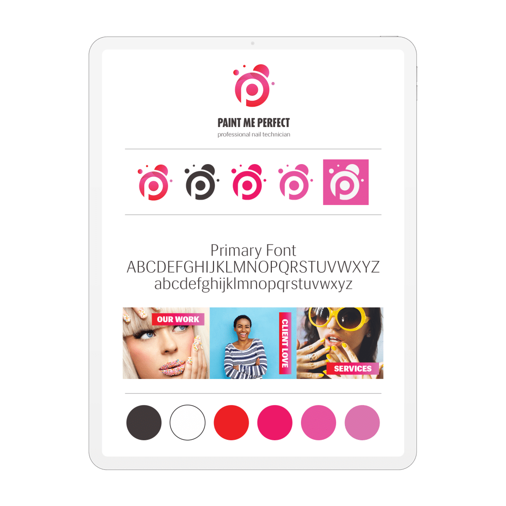
Paint Me Perfect identity board showing logo variations, typography, the colour palette and example applications.
Paint Me Perfect: a connected brand identity
Project scope. A brand identity for a modern, fun nail business, with a logo, colour palette and supporting visual assets.
Our contribution. Simply Graphic designed the identity. The current board brings the logo variations, primary typography, colour palette and example applications into one reference.
Design decisions. The circular monogram is shown in colour, black and reversed variations. Pink and red carry through the palette and supporting imagery; the type sample and Work, Client Love and Services examples show the identity in context.
Delivered design. The delivered identity board connects the core mark, its variations, typography, colours and example applications, rather than showing the logo alone.
Sprout brand identity
The Sprout project presents a brand and brand guide covering logo usage, colour, typography and imagery for a microgreens business. It offers a useful example of the relationship between the core identity and its guidance.
Nanocare brand identity
Explore the logo, colour palette and visual design presented for Nanocare’s cleaning range. Use the project to discuss the kind of consistency your own products and communications need.
Make the first conversation useful
What to bring to your brief
- Business name, offer, audience and the reason for the project.
- Current logos, brand files and examples of everyday material.
- What should remain recognisable and what needs to change.
- Website, packaging, presentation and print applications required.
- Existing research, approval contacts and rollout priorities.
Useful resources
Plan the next step
Brand strategy brief guide
Clarify the audience, positioning and message behind the visual direction.
Brand identity and deliverables
Plan the visual system, applications and handover your team needs.
Meet the team behind the work and see how we collaborate with clients in South Africa and internationally.
Before you start
Your questions, answered
That depends on the current identity and why it is no longer working. A refresh can retain useful recognition while improving consistency. A larger change may be appropriate when the audience, offer or business direction has changed. Share the current material so the scope can be assessed.
A logo is one identifying element. A visual identity also considers colour, typography, imagery and supporting graphics, together with how they are applied. The deliverables should reflect where your business needs the identity to work.
The agreed handover identifies the logo versions, formats and guidance your team needs. Tell us which platforms and suppliers will use the files. Font and image licensing requirements should also be clarified for the intended applications.
Yes. Website design, company profiles, social artwork and printed collateral can be scoped around the same system. Listing the required applications early makes the rollout easier to prioritise and avoids treating each new format as an assumed inclusion.
Your next step
Give your brand a clear next step
Share your current identity or starting brief, the audience and the material you need. We can then discuss the right direction and scope for the work.