Branding Basics: Strategy, Identity and Handover
TL;DR
In this guide
- Define the applications. Name the website, documents, campaigns or physical materials the system must support.
- Agree the deliverables. Identify which identity elements, templates and files are included.
- Plan the handover. Provide rules, examples and ownership so people can use the system.
A brand identity is a visual system that helps a business present its information consistently. The brief should define its applications and deliverables, rather than assuming that a logo file completes every design need.
The topic at a glance
The practical overview
01
Core identity
Logo arrangements, colours, typography and visual direction form the starting tools.
02
Application system
Layout rules, imagery, diagrams and templates connect those tools to actual communication.
03
Usable handover
Approved masters, exports, guidance and permission responsibilities make the work practical after delivery.
Before you begin
What to prepare
Use these practical checks to gather the information needed for the next step.
- Audience, offer and approved strategy decisions
- Current identity assets and required applications
- Real copy and image examples
- Templates the team will need to edit
- Deliverable and approval responsibilities
A useful reminder
Name the system you need
A website, packaging range and editable sales document can require different applications. Agree which are part of the identity project and which need a separate brief.
The practical guidance
Steps, tools and examples
Branding basics: start with the promise and the audience
Branding connects what a business stands for with what people experience when they deal with it. A logo, colour palette and website help communicate that direction, while the service, product and day-to-day behaviour need to support it. Start by describing who the business serves, the problem it solves and the reasons a customer should choose it. Use specific, supportable statements rather than a promise the business cannot consistently deliver.
Write down the messages and tone that should guide the team. A specialist consultancy might explain decisions clearly and calmly; a consumer product may need a more informal voice. The useful question is whether the voice fits the audience and stays recognisable across proposals, website copy, support replies and campaign materials.
Turn these choices into practical standards. Agree the key messages, terminology, visual rules and approval responsibilities, then test them with real applications. Review the standards when the offer or audience changes. This gives the identity work a clear foundation and helps prevent a collection of unrelated designs from becoming the brand by default.
Separate direction from the visual tools
The brand strategy brief defines audience, offer and supported messages. The identity turns that direction into a coherent visual approach. Keeping the distinction clear helps the team understand which decisions are ready and which require further discussion.
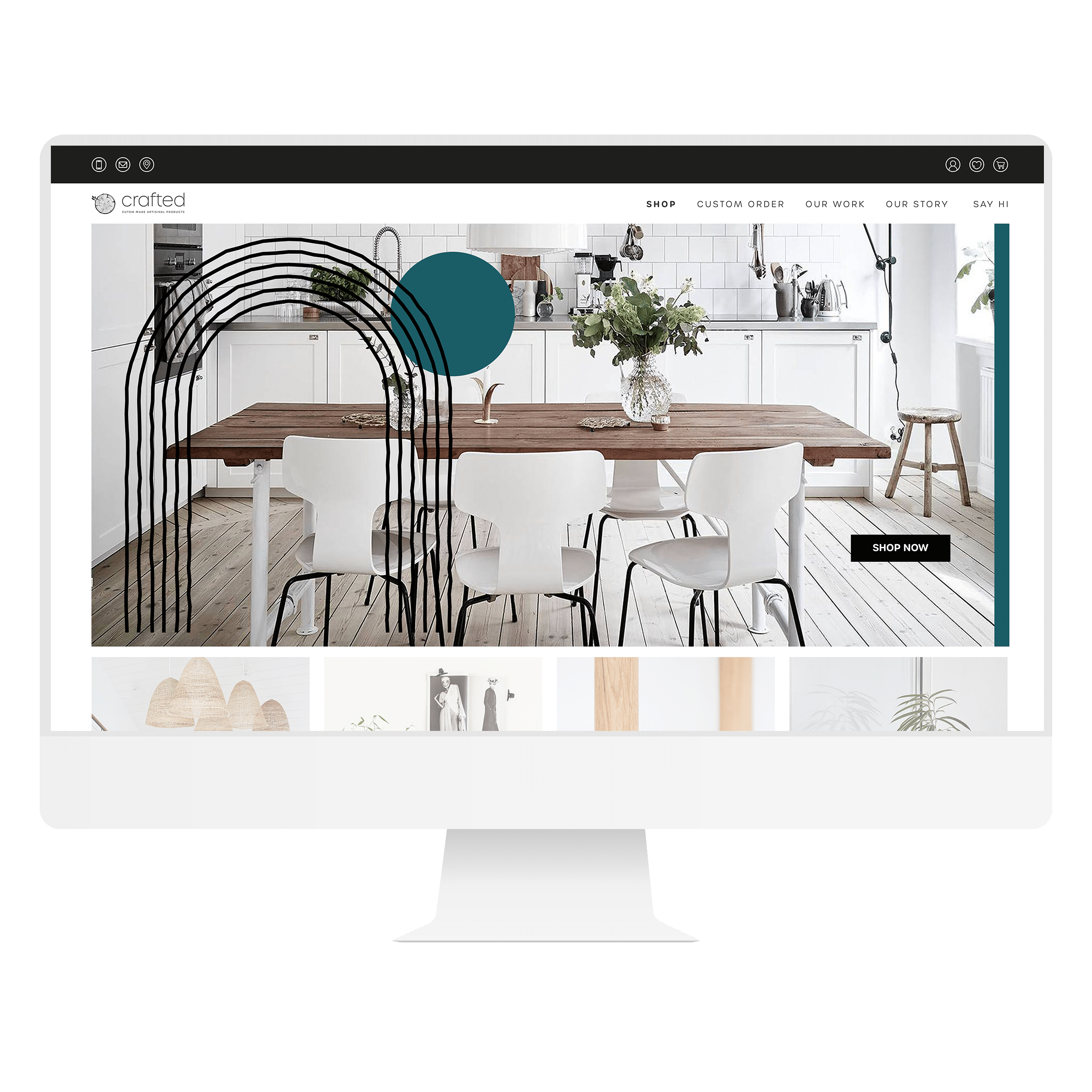
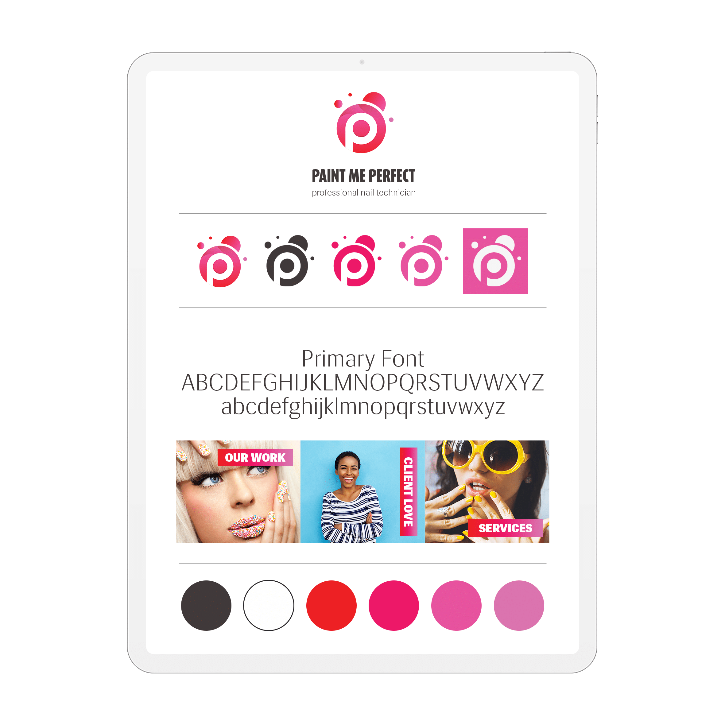
A practical system may include logo arrangements, a palette, typography, imagery, layout rules and template examples. The exact scope depends on the applications. A proposal-driven consultancy and a product business with a label range do not need identical deliverables.
Build a deliverables matrix
Use one row per item: application; purpose; core identity elements; required template; editable source; ordinary exports; guidance; permissions; approval owner. “Brand files” is too vague to tell the team whether it receives an editable presentation, a print export or only a logo folder.
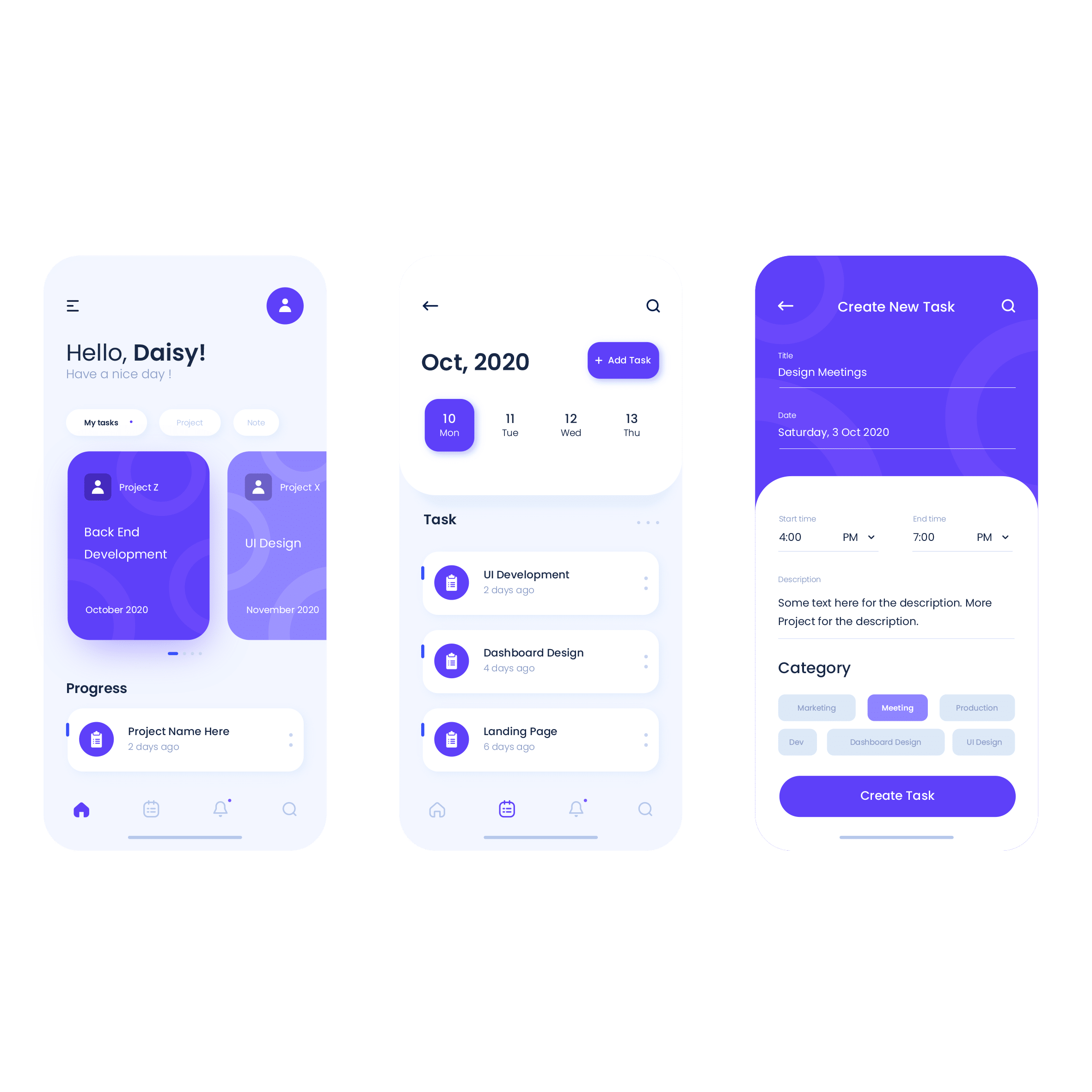
Specify the content used for testing. A template should accommodate real service names, quantities of text and image shapes. Identify what staff may change and how to handle an application that falls outside the supplied examples.
Review the system across applications
Compare several actual uses together. Does the typography establish a clear hierarchy? Can the palette support readable text? Do images and diagrams have a consistent role? Does the logo arrangement fit the smallest relevant space?
Fictional example: a consultancy needs proposals, a website and social advice posts. Its matrix prioritises clear headings, a diagram style, a restrained palette and editable templates. Testing a long service name reveals that one layout needs an alternative. The result is a documented application decision, not a promise of higher sales.
Make the files and permissions understandable
Distinguish the approved masters from exports that staff will use regularly. Use clear names and application examples. Record the colour values and type choices with their intended context, and identify who obtains and maintains required font or image permissions.
Agree any editable-source and ownership arrangements explicitly. A reference image, licensed asset and original commissioned artwork do not automatically have identical reuse rights. The handover should make the agreed arrangement understandable instead of leaving the team to infer it.
Copy the handover acceptance check
Confirm: agreed deliverables received; current versions identified; essential exports open; templates tested with real content; application guidance available; permissions recorded; staff owner named; unanswered questions logged. Keep the review related to the brief rather than requiring files that were never included in the project.
Use the logo process guide and colour theory guide for those individual decisions. Once the system is handed over, the brand governance guide covers keeping the library and materials consistent.
Keep the work useful
Common mistakes to avoid
- Treating the logo as the entire identity
- Approving only empty presentation mockups
- Leaving editable templates and exports undefined
- Assuming font and image permissions transfer automatically