The Logo Design Process: From Brief to Tested Handover
TL;DR
In this guide
- Give the designer context. Explain the audience, offer and places the logo must work.
- Review concepts against the brief. Use reasons and applications rather than voting on favourites.
- Test before handover. Check small use, backgrounds, one-colour use and the required exports.
The logo design process turns a business brief into a mark that can be used in real applications. The work includes research, concept decisions, refinement and testing, with a clear handover of the agreed versions and files.
The topic at a glance
Six stages of a logo project
01
Brief
Agree the business context, applications, retained assets and approval responsibilities.
02
Research
Review the category, competing identities and visual references without copying them.
03
Concepts
Explore and explain a small set of meaningful directions tied to the brief.
04
Refinement
Resolve proportions, lettering, spacing and the relationships between versions.
05
Testing
Assess the mark in actual small, large, digital and physical applications.
06
Handover
Deliver the agreed masters, exports and guidance, with permissions and ownership responsibilities confirmed.
Before you begin
What to prepare
Use these practical checks to gather the information needed for the next step.
- The business offer and priority audience
- The most important applications and smallest uses
- Existing identity assets to retain or replace
- Relevant competitors and visual references
- One consolidated feedback and approval route
A useful reminder
Evaluate the mark where it will live
A large presentation can conceal a small-use problem. Include the mobile header, document footer, sign or label that matters to the project before final approval.
The practical guidance
From brief to tested handover
Start with the brief and research
Explain what the organisation does, whom it serves and how the identity will be encountered. Include actual applications rather than a request for a logo that works “everywhere”. A business using small software icons and technical documents has different priorities from a retailer using labels and storefront signage.
Research helps establish the surrounding visual context and distinguish a reference from a direction to copy. Record any existing recognition that should be retained. Questions about registration or clearance belong with the responsible specialist; a design review should not promise a legal conclusion.
Develop and explain concepts
Each concept should have a rationale tied to the audience and brief. Review the mark, name treatment and hierarchy together. Ask what the direction communicates and how it behaves in a relevant application. More options are not automatically more useful if they repeat the same idea without resolving the actual question.
Give consolidated feedback: observation, affected application and desired result. “The name becomes difficult to read in the narrow document footer” gives a refinement target. Keep new scope requests separate from decisions about the concept.
Refine, test and approve
Refinement resolves the details that make a selected idea usable: spacing, proportions, lettering, symbol balance and alternative arrangements. Test the smallest relevant size, a one-colour treatment and the backgrounds needed for the work. Review real printed or supplier-produced samples where the production method calls for them.
Fictional example: a consultancy needs its identity in proposals, a website header and a small event badge. Testing shows that a detailed symbol is unclear on the badge. The team simplifies that version and documents its use. The decision follows an application check rather than a promised increase in recognition.
Copy a logo review and handover sheet
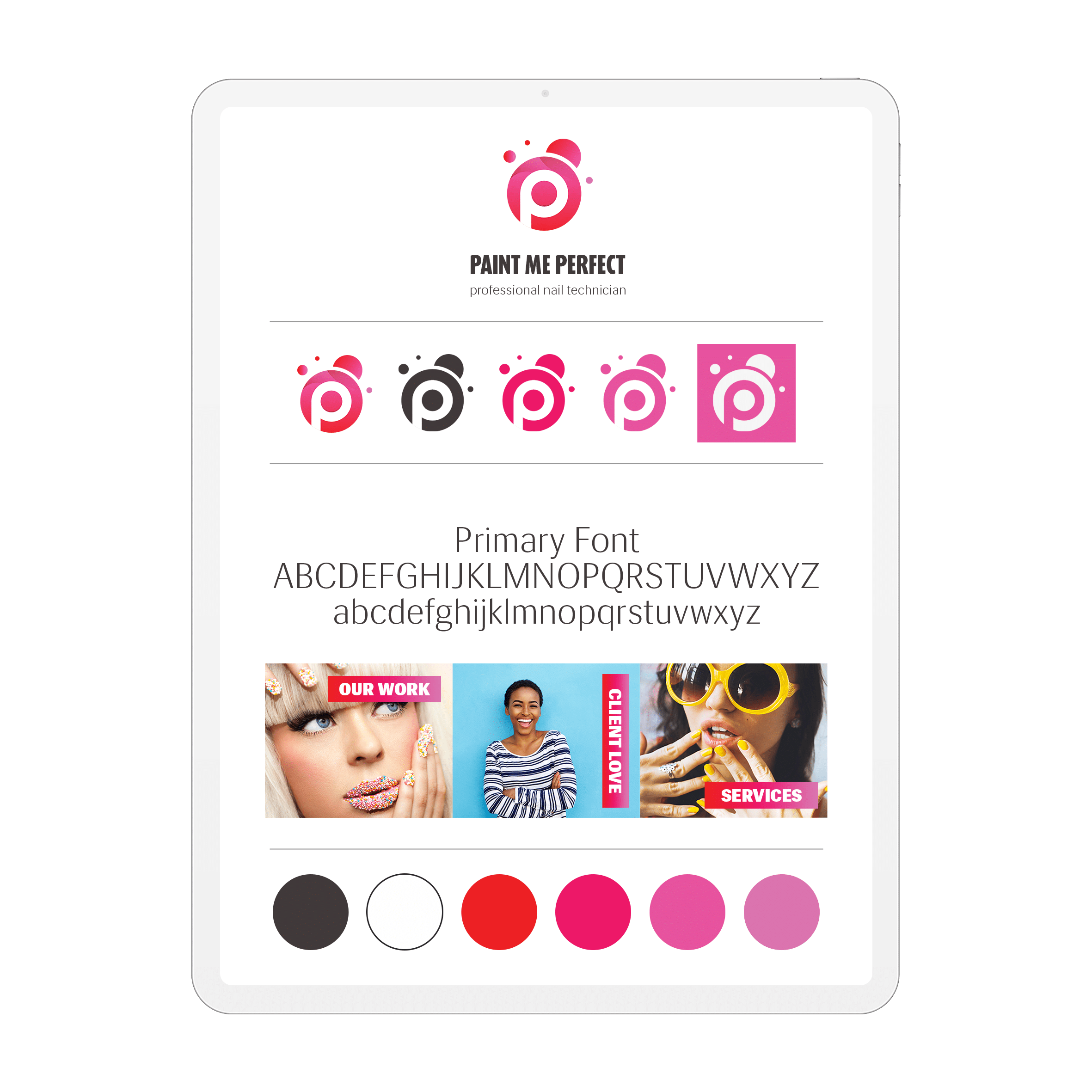
Record: agreed concept; primary arrangement; alternate arrangement; one-colour versions; smallest tested application; background examples; master files; exports; colour values; font requirements; permission responsibility; approval owner. Identify which items are included in the project and which require further work.
A usable handover explains which file to choose and where it belongs. It should distinguish editable source material from ordinary exports and identify the person maintaining the approved files. Continue with the identity-system guide if the project also includes typography, imagery, layout rules and templates.
Useful answers
Common logo questions
What are the qualities of a great logo?
Assess clarity, an appropriate relationship to the business, a distinguishable direction and reliable use in the agreed applications. Test the mark with real names, backgrounds and sizes. These checks are more useful than claiming that every strong logo must follow one visual style.
What types of logos are there?
Common approaches include a wordmark built around the name, a letter-based mark, a symbol and a combination of name and symbol. The arrangement should follow the name, audience and applications. Compare concepts in the same practical tests rather than assuming one category is best.
Which type of logo would best suit my company?
Use the offer, name, audience and applications to compare a wordmark, symbol or combination. A concept should explain why its arrangement fits those requirements; there is no single type suitable for every organisation.
What are the best logo colours?
Choose colours in the context of the identity and real applications. Test backgrounds, small use and one-colour versions. The website palette and colour theory guides address application choices without universal colour-emotion rules.
What fonts should I consider?
Review readability, the character of the name and the intended applications. Confirm font licensing and whether staff need to use the same family in documents or templates. Lettering inside the mark and everyday document typography are related decisions.
Should I design a logo myself or hire a graphic designer?
Consider the complexity of the applications and the ability to research, refine, test and prepare usable files. Define the work you need help with before choosing an approach, rather than assuming that a drawing alone completes the identity.
Where should I display my logo?
Prioritise the places customers actually encounter the business: relevant website areas, documents, product applications and chosen social channels. Use the appropriate approved version and keep the surrounding content readable.
What are some mistakes to avoid?
Avoid imitation, preference-only feedback, missing small-use checks and an unclear handover. Record the application that revealed a problem so the change can be assessed.
How should the logo work as the business changes?
Design for the known applications and document a usable system. Review it when the name, offer or important applications change. No design process can guarantee that a mark will never need adjustment.
Keep the work useful
Common mistakes to avoid
- Expecting the designer to infer an unstated business goal
- Copying a category leader’s mark as a shortcut
- Approving only a large colour presentation
- Leaving files, variants and permissions unconfirmed