Headwear 24: Custom Headwear Website Design
At a glance
Project summary
Headwear 24 shows how a product brand can make a strong first impression while explaining what customers can customise. We translated the Figma design into a responsive website, bringing together lifestyle imagery, branding choices and clear next steps in one connected browsing experience.
- A custom headwear website built around campaign photography and product detail.
- A three-step customisation story supported by clearly labelled branding options.
- A responsive Figma-to-website build with working galleries, navigation and design enquiry entry points.
Custom headwear is visual: cap shape, an embroidered logo and how it looks when worn all matter. The Headwear 24 website gives those details space to lead. Bright yellow, charcoal panels, oversized typography and campaign photography create a distinctive identity, while a simple customisation sequence helps visitors understand the offer. The result is an example of custom headwear website design for brands that need both personality and practical product information.
Headwear 24 is a Figma-led website that we designed and developed with HTML, CSS and JavaScript. The linked website is a preserved copy of the delivered design. We host these snapshots efficiently with HTML, CSS and JavaScript so the original presentation remains available as clients update their live websites. In this preserved copy, shop and account controls open website enquiries; live commerce and reseller connections are not represented.
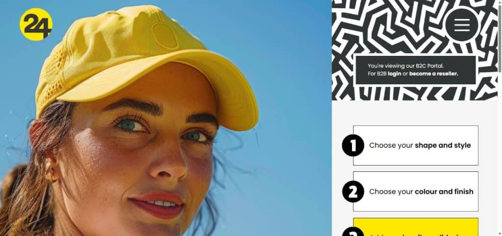
Preserved Headwear 24 website: campaign photography and clearly labelled customisation steps. Shop and account connections are not represented in this snapshot.
The starting point
The website design challenge
The design task was to turn a bold Figma composition into a usable website that retained its visual character across screen sizes.
01
Make the product memorable
Use lifestyle and product imagery together, so visitors can see the headwear as both a physical item and part of a brand story. Keep the colour palette and graphic details consistent.
02
Explain the choices
Give customisation a clear sequence: shape and style, colour and finish, then the added logo or design. Bring the different branding options into a readable list rather than leaving them hidden in imagery.
03
Keep the experience usable
Adapt the desktop mosaic for tablets and phones, with readable controls, deliberate image crops and straightforward navigation. Provide working ways to explore the design and start a website enquiry.
The work
How we approached the responsive website design
1. Build a connected visual system
The desktop layout uses a three-column mosaic rather than a conventional stack of identical sections. A large campaign image introduces the brand, with neighbouring panels for customisation, product imagery and branding information. Yellow repeats through the cap photography, graphic details and buttons. Charcoal and white give the brighter panels contrast. Translating that composition from Figma required attention to panel proportions and image positioning, so the website retained the design’s rhythm without distorting its photography.
2. Turn product detail into a clear journey
The three customisation steps make the offer easier to scan. A separate branding list introduces embroidery, heat transfer, screen printing, patches and other treatments through plainly labelled controls. Campaign and product galleries let visitors select different images without autoplay. Section links connect the compact menu to the relevant parts of the page. Together, these elements demonstrate how a branded merchandise website can combine inspiration with useful information before asking someone to take the next step.
3. Design for smaller screens and real interaction
The mosaic changes to two columns on tablets and a single-column sequence on phones. Images remain tied to their panels, and the customisation steps, branding rows and controls stay readable. We implemented menu and enquiry dialogs, keyboard operation, focus return and reduced-motion support. Enquiry controls retain the selected topic, making the next conversation more specific. In this preserved snapshot, shop, reseller and member controls open a website enquiry. Live commerce and reseller connections are not represented here.
What changed
What we delivered
The delivered website brings the bold Figma visual direction into a working responsive experience. Campaign panels, product galleries and branding information form a connected experience that visitors can explore on desktop and mobile.
- A distinctive, product-led website layout translated from the supplied Figma design.
- Desktop, tablet and mobile layouts with deliberate image crops and readable controls.
- Manual campaign and product galleries, plus navigation to key sections.
- Topic-aware design enquiry dialogs and a form with required-field validation.
- Self-hosted fonts and local image assets, including smaller lossless WebP product images.
Planning a similar project?
Start with your audience and the next step.
Tell us what your website should explain and what visitors should do. We can help define the content, design and build around that goal.
Recorded browser checks covered eleven screen widths from 320 to 1920 pixels. The published build was also checked at 390, 1440 and 1920 pixels, with loaded imagery and fonts and no horizontal overflow. Menu navigation, gallery selection and keyboard behaviour were included in the interaction review.
For your website
What merchandise brands can take from this project
Show the detail and the context: A close-up explains the product; a lifestyle image helps people imagine using it. Plan both when preparing photography for a product website.
Make customisation understandable: Visitors need to know which choices they can make. Use a short sequence and clear labels before introducing a quote request, configurator or purchase journey.
Define the website’s next step: An enquiry site, product catalogue and online shop need different content and functionality. Agree the intended journey early, then scope the integrations and information that support it.
For a practical starting point, use our website project planning guide and guide to writing a website brief.
Common questions
Questions about product and merchandise website design
01
What should a custom headwear website include?
Start with strong product photography, clear descriptions of styles and branding choices, and an obvious way to enquire or buy. For custom orders, explain what customers need to provide, such as artwork, quantities and deadlines. Reseller information should have a clearly labelled route if it serves a different audience.
02
Does the preserved Headwear 24 website process purchases?
This preserved website demonstrates the design and frontend experience. Its shop, catalogue and member controls open a website enquiry; the snapshot does not process purchases or provide live reseller accounts. A live shop requires an agreed product catalogue, pricing, stock, payment and fulfilment setup.
03
How do you prepare for a branded merchandise website project?
Gather brand assets, product imagery, product categories and details of the customisation process. Decide whether the priority is enquiries, catalogue browsing or online sales. Then agree the page structure and content before development. Our website project planning guide explains how to organise those early decisions.
Work with Simply Graphic
Build a website that shows what makes your products worth choosing
Planning a product brand or branded merchandise website? Tell Simply Graphic about your range, your audience and the action you want visitors to take. We can help define the design and website scope.
Explore our website design and development services, or share your requirements to start a conversation.