TicketFlow: SaaS Marketing Website Design
At a glance
Project summary
TicketFlow shows how SaaS website design can make a software product easier to understand. Simply Graphic translated the Figma design into a responsive marketing website with original copy, detailed interface visuals and a consistent enquiry journey.
- A product-led page that moves from overview to features, resources and enquiry.
- Responsive layouts with three, two and one-column card grids.
- A published marketing website with editable HTML content and locally hosted assets.
A software marketing website has to explain a product before asking someone to take the next step. Visitors need a clear starting point, a useful view of the interface and enough detail to understand where the product fits into their work.
TicketFlow is a SaaS marketing website that we designed and developed with HTML, CSS and JavaScript. Our work covered its visual presentation, product story and enquiry experience. The linked website is a preserved copy of the delivered design. We host these snapshots efficiently with HTML, CSS and JavaScript so the original presentation remains available as clients update their live websites. Product screens, figures, ratings, integrations and certifications shown in this snapshot remain illustrative; they are not claims about measured results or operational integrations.
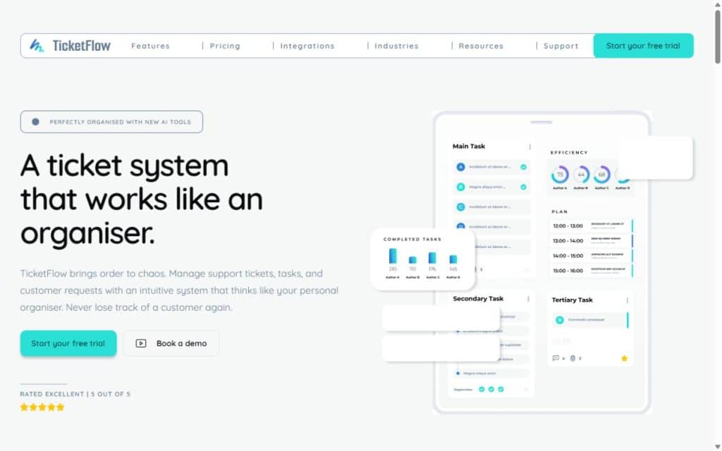
Preserved TicketFlow marketing website. Product screens and ratings shown in this snapshot are illustrative and are not presented as measured client outcomes.
The starting point
The website brief
01
Explain the product
Give the page a clear sequence: introduce the idea, show the interface, explain feature groups, then provide resources and a next step.
02
Preserve the Figma character
Carry the rounded cards, layered tablet artwork, bright blue-to-turquoise gradients and decorative shapes into a usable responsive layout.
03
Build a useful review experience
Make navigation, mobile menus and enquiry controls work together as a useful website experience.
The work
From Figma to a responsive website
1. Establish a clear page hierarchy
The hero pairs a short headline and supporting explanation with a tablet interface, calendar and chart. This gives visitors an immediate visual reference for the product story. Repeated calls to action provide a next step after the feature and support sections, rather than relying on a single button at the top.
Feature cards use distinct copy about organisation, scheduling, collaboration, reporting and automation. Headings, short explanations and concise lists let readers scan the page before choosing which details to read. The testimonial-shaped panel carries descriptive content without an invented customer quote.
2. Adapt the composition at each screen size
The desktop content sits in centred rows capped at 1,194 pixels. Three-column cards become two columns on tablets and one column on phones. The hero artwork scales proportionally, while mobile navigation moves into an expandable menu.
Decorative imagery follows its role in the design. The feature shape stays with its heading row. The larger security-section shape is attached to the full-width section and clipped at the screen edge; on phones, it moves below the text. This keeps the artwork expressive while protecting reading space.
3. Turn visual details into usable page content
The five-row task preview is built in native HTML, so its text remains selectable and editable. Task connectors stop between rows, and small icons help distinguish feature cards. Product imagery, SVGs and fonts are hosted with the site; the page does not depend on temporary design-export links.
Trial, demo and related controls open an enquiry about the website design. The interaction includes validation, a pending state and retention of entered details after a failed response. Keyboard checks covered the menu, Escape handling and returning focus after the dialog closes.
What changed
What the project delivered
The result is a published, interactive SaaS marketing website. Project checks recorded responsive behaviour across 320–1,920-pixel widths and confirmed that the deployed files matched the reviewed build.
- A complete single-page software marketing website.
- Original, section-specific website copy.
- Responsive hero, feature, integration and resource layouts.
- An editable HTML task panel and locally hosted visual assets.
- Mobile navigation and an accessible enquiry dialog.
- Hosted checks with no horizontal overflow, missing images or browser errors.
Planning a similar project?
Start with your audience and the next step.
Tell us what your website should explain and what visitors should do. We can help define the content, design and build around that goal.
For your website
What to plan for your SaaS website
Begin with the visitor’s questions: what does the product do, who is it for, and what should someone do next? Gather real interface screenshots, verified feature details and the intended demo or trial process before writing the page.
Treat the marketing website and the software application as separate deliverables in the brief. Agree which actions need a simple enquiry form and which require a connection to booking, account creation or the product itself. Use documented evidence for customer numbers, testimonials and certifications. Clear scope and credible content give the design something substantial to communicate.
For a practical starting point, use our website project planning guide and guide to writing a website brief.
Common questions
Questions about SaaS website design
01
What should a SaaS marketing website include?
Start with a clear product explanation, the audience it serves, useful interface visuals, feature benefits and a relevant next step. Add pricing, resources and verified proof where they help a buyer decide. The right structure depends on whether visitors should request a demo, start a trial or contact the team.
02
Can a Figma design become a responsive website?
Yes. The build needs to translate the design into flexible layouts, readable content and working interactions. TicketFlow uses different card grids, scalable hero imagery and mobile navigation. Reviewing several screen widths helps reveal problems that a single desktop mock-up cannot show.
03
What should we provide before starting a software website project?
Prepare your audience, positioning, feature list, brand assets, interface images and conversion goal. Identify any product, CRM or scheduling connections separately. Bring approved evidence for performance claims and customer feedback so the copy can be useful and accurate from the start.
Work with Simply Graphic
Planning a website for your software business?
Simply Graphic can help turn your product story and design direction into a clear, responsive marketing website. Share your audience, goals and project requirements so we can discuss the right structure and scope.
Explore our website design and development services, or share your requirements to start a conversation.