Just One Seed: Sustainability Website Design
At a glance
Project summary
Just One Seed demonstrates a sustainability website design that moves from a visual introduction to a problem, a proposed solution and a simple enquiry. The project turns a Figma composition into a working responsive website while preserving its distinctive imagery and section-by-section story.
- An immersive campaign page with a clear beginning, middle and next step.
- Full-screen desktop storytelling that becomes a natural reading flow on smaller screens.
- Custom section navigation, a demonstration counter and a focused enquiry form.
A sustainability campaign needs more than striking photography. Visitors should understand what the idea is, why it matters and how to get involved. The website has to connect those questions without making people work through a wall of text.
Just One Seed is a Figma-led sustainability website that we designed and developed with HTML, CSS and JavaScript. Our work brought together the responsive page, navigation, visual interactions and enquiry experience. The linked website is a preserved copy of the delivered design. We host these snapshots efficiently with HTML, CSS and JavaScript so the original presentation remains available as clients update their live websites. The planting counter and environmental figures in this snapshot are not presented as verified campaign impact.
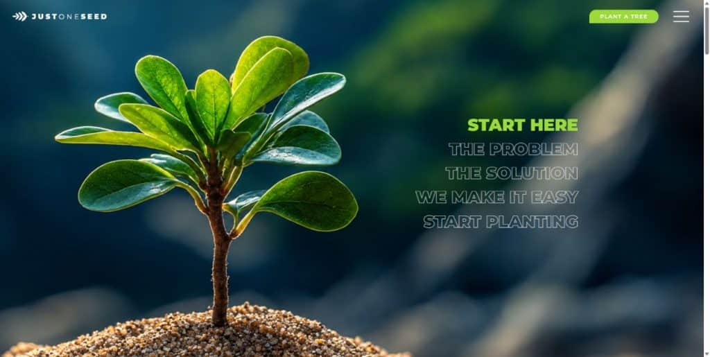
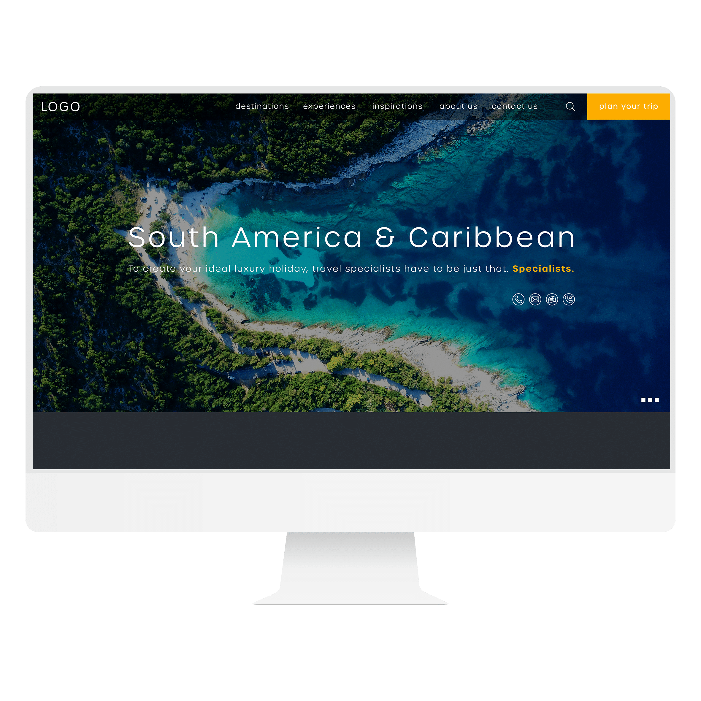
Preserved Just One Seed website: photography and section navigation introduce the environmental story. The snapshot counter is a visual demonstration, not independently verified impact data.
The starting point
The sustainability website design challenge
01
Tell one connected story
Organise the page around the environmental problem, the planting idea, how participation could work and the next step. Let each section answer a different visitor question.
02
Protect the visual character
Retain the young-tree hero, forest photography, earthy colours and planting illustration while keeping the content and controls readable.
03
Make the experience adaptable
Translate the full-screen desktop composition into a usable phone and tablet layout, with direct section links and a clear enquiry route.
The work
From Figma storytelling to a usable website
1. Give the story a deliberate sequence
The hero creates an immediate visual introduction. A separate mission band then gives the campaign idea its own space before the page moves into the problem, the solution and the participation process. Keeping that band separate preserves the difference between an opening image and the explanation that follows it.
Repeated section navigation lets visitors follow the sequence or jump to a relevant topic. The participation button leads to the enquiry section. This makes the page useful for both someone exploring the full story and someone already ready to ask a question.
2. Let the layout change with the screen
On suitable desktop screens, the main sections fill the viewport and scroll over the preceding section. Centred content rows give the text a consistent reading area while photography covers the surrounding space. The forest section combines a full-width image with a contrasting content panel.
On smaller screens and short desktop windows, the content flows naturally instead of being squeezed into fixed-height scenes. The same simpler flow applies when a visitor prefers reduced motion. The mission statement stacks when it needs more room, and controls remain reachable without horizontal scrolling.
3. Keep visual details connected to their purpose
The planting illustration is positioned relative to the form container, so it stays with that component as the viewport changes. Its placement was adjusted to keep the leaves clear of the input fields and preserve readable feedback. Decorative artwork supports the invitation to enquire without getting in the way of completing it.
The animated counter demonstrates a configurable visual treatment. In this preserved snapshot it is not connected to a live planting database. The enquiry interface validates required information, shows submission feedback and preserves entered details after a failed response. Navigation and menu behaviour were also reviewed with a keyboard.
What changed
What the website project delivered
The delivered website brings the environmental design together as an interactive, responsive page. The project records include desktop, tablet and mobile checks from 320 to 1,920 pixels, with no horizontal overflow or broken images in the reviewed layouts.
- A complete campaign website built with HTML, CSS and JavaScript.
- A distinct hero, compact mission band and connected narrative sections.
- Full-width imagery with consistent, centred reading areas.
- Direct section links and an expandable navigation menu.
- Reduced-motion handling and adaptable layouts for short viewports.
- A form-relative planting illustration and a validated enquiry interface.
Planning a similar project?
Start with your audience and the next step.
Tell us what your website should explain and what visitors should do. We can help define the content, design and build around that goal.
For your website
Planning your own environmental or sustainability website
Start with the action you want someone to take. A campaign asking for enquiries needs a different journey from one collecting donations, enrolling volunteers or selling products. Agree that scope before designing the page so the main call to action leads somewhere useful.
Prepare a short explanation of the mission, approved photography and a source for each impact claim. If you want a live counter, identify who maintains the underlying data and how it will be connected. A number that animates attractively still needs a reliable source before it can represent real activity.
Review the story on a phone as well as a large monitor. Long headlines, maps and decorative illustrations need enough space to remain understandable. A simpler mobile reading flow can preserve the character of the design while making the information easier to use.
For a practical starting point, use our website project planning guide and guide to writing a website brief.
Common questions
Questions about sustainability website design
01
What should a sustainability campaign website include?
Include a clear mission, the problem being addressed, an explanation of the proposed activity and a practical next step. Use sourced evidence for environmental or impact claims. Choose the page structure around the intended audience and whether the goal is an enquiry, participation, a donation or another action.
02
Can an immersive website still work well on mobile?
Yes, when its layout adapts to the available space. Just One Seed uses full-screen storytelling on suitable desktop screens and a natural content flow on smaller or shorter viewports. The mobile review should cover navigation, readable text, image framing and the ease of reaching the main action.
03
Can the site include a live impact counter or donation flow?
Those features can be scoped separately. A live counter needs a reliable data source and an update process. A donation journey needs an agreed payment provider, transaction handling and confirmation flow. This preserved snapshot demonstrates the counter treatment and enquiry experience; it does not connect to live impact data or donation processing.
Work with Simply Graphic
Need a website that explains your mission clearly?
Simply Graphic can help shape your content and design direction into a responsive website with a useful visitor journey. Tell us about your audience, your message and the action you want people to take.
Explore our website design and development services, or share your requirements to start a conversation.