Wellgo: Healthcare Website Design
At a glance
Project summary
Simply Graphic translated the Wellgo Figma design into a published healthcare marketing website. The project shows how healthcare website design can organise detailed service information without losing the warmth of a people-focused brand.
- Swedish content brought into a clear journey from services and team information to process and membership sections.
- Responsive layouts that preserve the design’s photography, soft colours and rounded cards across screen sizes.
- A published marketing website with working navigation and responsive enquiry controls.
Wellgo’s supplied design presents medical weight management, menopause support and health checks. Those subjects give visitors a lot to understand: what the service covers, how the process works, who provides support and how membership is presented. The website needed a clear visual hierarchy so each topic had a recognisable place.
We designed and developed Wellgo as a responsive healthcare marketing website, implementing its Swedish content, imagery and section structure with HTML, CSS and JavaScript. The linked website is a preserved copy of the delivered design. We host these snapshots efficiently with HTML, CSS and JavaScript so the original presentation remains available as clients update their live websites. The snapshot does not provide healthcare services or connect to patient accounts, membership purchases or payments.
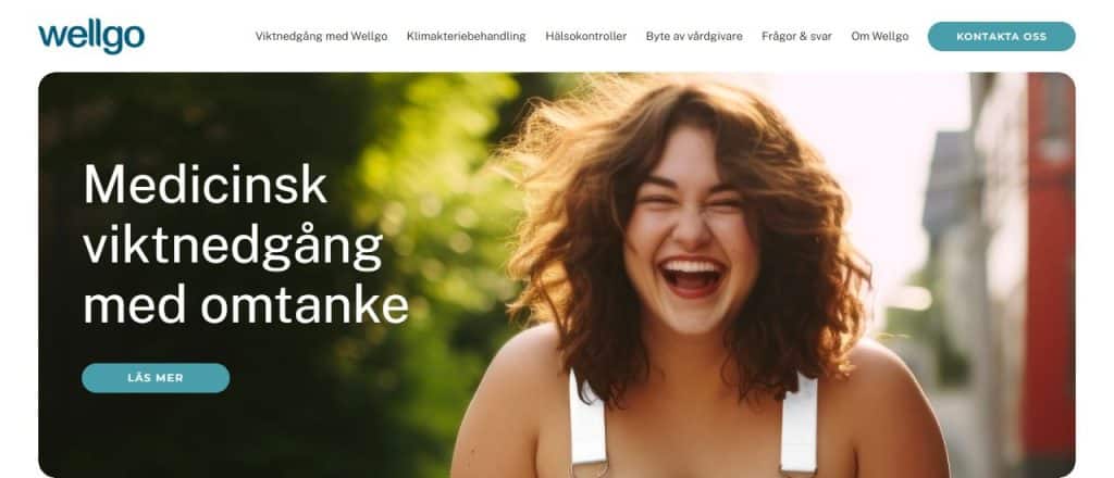
Preserved Wellgo marketing website: Swedish service content and a calm, responsive visual layout. The snapshot does not connect to patient systems or payments.
The starting point
The design challenge
01
Make the journey understandable
Organise service introductions, team information, a three-step process, the app presentation and membership options into a readable sequence. Visitors should be able to scan the page and find the topic they need.
02
Keep a consistent visual language
Carry the supplied mint, teal, sage and cream palette through the page. Preserve the rounded image frames, generous spacing and people-focused photography that give the design its recognisable character.
03
Translate the design across devices
Adapt a wide desktop composition for smaller screens while keeping content in a sensible order. Navigation, cards, image crops and enquiry controls all needed to remain usable on mobile.
The work
How we approached the website
1. Build a clear content hierarchy
The hero introduces the main service with a strong headline and a clear next step. Below it, distinct sections separate treatment introductions, the team, the process and membership information. The three-step cards make the proposed journey easier to follow than a single long block of text.
Navigation links take visitors to relevant sections. Repeated button styles and headings give the page a consistent rhythm while allowing different topics to have their own colour and imagery.
2. Preserve the Figma composition
We implemented the supplied design in HTML, CSS and JavaScript, with a PHP handler for design enquiries. The desktop content row is capped at 1,192 pixels. Photography retains its intended framing, and the app illustration sits inside a contained panel with decorative circles clipped at its edges.
Assets and webfonts are hosted locally. Where the original proprietary font was unavailable for licensed self-hosting, Public Sans provided a disclosed alternative; Montserrat carries the button styling. These choices keep the implementation practical without depending on temporary design-file asset links.
3. Check real interactions
The implementation includes a mobile menu, section navigation and an enquiry dialog. Keyboard users can open the dialog, move through its fields, close it with Escape and return to the control that opened it.
Responsive checks covered screen widths from 320 to 1,920 pixels. Form interaction checks covered validation, duplicate-submit prevention and keeping a message when submission fails. These checks demonstrate the website’s interface behaviour; they do not establish email inbox delivery or any healthcare service functionality.
What changed
What we delivered
The result is a published healthcare marketing website with a complete visual journey that visitors can explore in the browser. The delivery is concrete and visible:
- A responsive Swedish marketing website based on the supplied Figma design.
- Service, team, process, app presentation and membership sections with a shared visual style.
- Mobile navigation and keyboard-accessible design enquiry interactions.
- Locally hosted imagery and webfonts, deployed on a dedicated HTTPS subdomain.
- Browser checks with no horizontal overflow across the tested screen widths.
Planning a similar project?
Start with your audience and the next step.
Tell us what your website should explain and what visitors should do. We can help define the content, design and build around that goal.
For your website
What healthcare teams can take from this project
Start with the questions visitors need answered before choosing a service. A strong healthcare website structure connects those questions to clear sections and next steps. Plan the content hierarchy before polishing individual cards or adding more copy.
Treat the public marketing website, secure patient systems and payment flows as separate parts of the project brief. This makes the scope easier to cost and review. Any treatment claims, qualifications, review counts or pricing should be verified by the organisation before publication.
For a practical starting point, use our website project planning guide and guide to writing a website brief.
Common questions
Questions about this healthcare website project
01
Was Wellgo built in WordPress?
This website uses HTML, CSS and JavaScript, with PHP for design enquiries in the preserved snapshot. A streamlined static build suits a focused marketing website. If your team needs routine content editing, define that requirement early so the website platform and handover can be chosen around your publishing needs.
02
Does the preserved website include a working patient portal or app?
The app panel is a visual presentation from the supplied design. This preserved snapshot does not connect to BankID authentication, patient records, clinical messaging, app accounts, membership registration or payments. Those systems need their own defined scope and secure implementation.
03
Can a similar website explain several healthcare services?
Yes. Wellgo shows one approach: distinct service introductions followed by team, process and membership information. For your website, agree which topics need their own pages, what evidence supports the content and where each enquiry should go.
Work with Simply Graphic
Plan a clearer website for your business
If your organisation needs a website that turns detailed services into a clear browsing experience, explore our website design and development services. Share your audience, content, design references and required integrations, and we can help define the right scope.
Explore our website design and development services, or share your requirements to start a conversation.