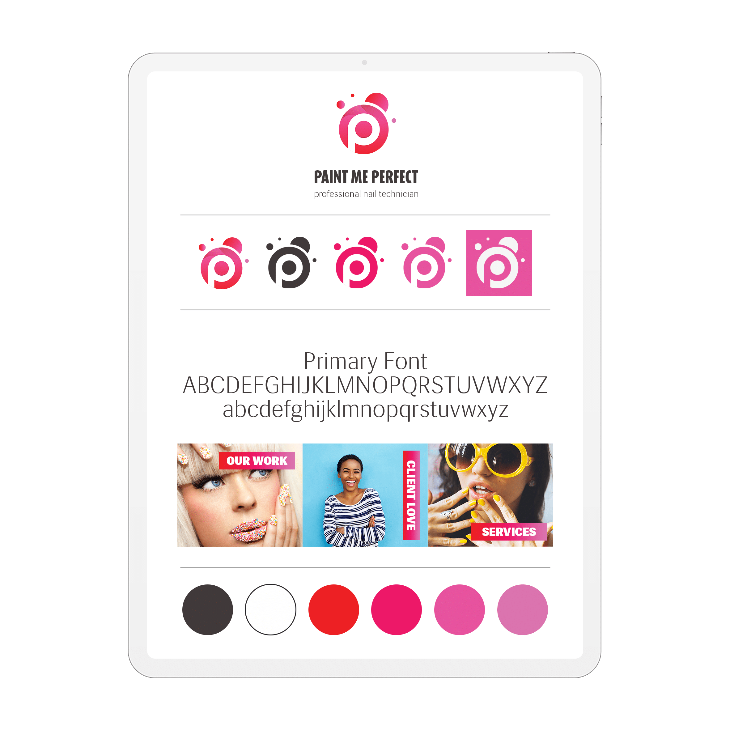
How to Choose a Website Colour Palette That Works
TL;DR
In this guide
- Assign colour roles. Define text, backgrounds, actions and supporting accents before choosing many swatches.
- Test combinations. Review real headings, forms, photographs and errors on the proposed backgrounds.
- Write usable rules. Record where each colour belongs and the combinations the team should use.
A website colour palette needs to do more than look attractive beside a logo. It should help people read content, recognise actions and understand page states while keeping the brand consistent.
The topic at a glance
The practical overview
01
Brand and context
Start with approved brand colours and the actual products, images and page information.
02
Page roles
Define a readable base, a clear action colour and supporting colours with specific jobs.
03
Application checks
Review contrast, focus, errors and selected states with real content, including mobile use.
Before you begin
What to prepare
Use these practical checks to gather the information needed for the next step.
- Current brand palette and logo files
- Sample page copy and product photographs
- The main buttons, forms and interface states
- Proposed text/background combinations
- An owner for the approved palette rules
A useful reminder
A brand accent need not be a text colour
A bright identity colour can work as an accent or large surface while a different approved combination provides readable small text. Test the actual use rather than approving a swatch alone.
The practical guidance
Steps, tools and examples
Begin with the page tasks
List what people need to find and do: read service information, compare options, complete a form or identify a selected filter. Then name the colour roles supporting those tasks. A base background, primary text, secondary text, action colour, surface and border are useful starting roles. They are decisions about use, not six unrelated decorative colours.
Use existing brand assets as the starting point. If a brand colour is difficult to use in a particular interface role, record that limitation and develop an appropriate supporting combination. A website palette can respect an identity without applying its brightest colour to every sentence.
Review real combinations
Put a service heading, body paragraph, button, link, form field and error message on the proposed backgrounds. Include the photographs and diagrams likely to sit beside them. Check both quiet and busy pages; an accent that works on a plain sample may disappear against a product image.
W3C’s contrast guidance explains how text and its background are assessed. Test the actual pairs, including text within buttons. Colour should be supported by labels or other cues when it communicates a state or problem.
Separate the palette from personal preference
Feedback such as “I prefer blue” does not explain whether a visitor can understand the page. Discuss the role, audience and application: is the main action recognisable, is supporting copy readable, and does the page remain coherent when it contains long content?
Fictional example: a repair company already uses a vivid orange logo. Its website uses dark text on pale backgrounds, orange as a deliberate accent and an approved darker button treatment with readable text. The decision follows the content and interface checks; it does not assume that orange produces a particular customer emotion or outcome.
Copy this palette worksheet
For each role, record: role name; colour value; permitted background; example element; hover/focus/selected state; contrast check; restrictions; approval owner. Add a screenshot from a real page so the rule has context. For a link, specify its ordinary and focused appearance. For errors, include the explanatory wording as well as the colour.
Try the worksheet on one complete page before extending it across the site. If a rule fails with a long label or a new photograph, update the rule and retest the affected combinations rather than adding an unexplained exception.
Prepare a focused design brief
Gather the palette, page examples and unresolved combinations. Tell the designer which identity elements should stay and which website tasks are unclear. Confirm whether the project includes the wider brand system, website implementation or only a palette review.
The colour theory guide explains the terms and screen/print context. The identity-system guide covers how colours sit with typography, imagery and templates. This article concentrates on choosing and applying colours to the website itself.
Keep the work useful
Common mistakes to avoid
- Giving every section a different accent
- Using colour as the only indication of an error
- Choosing a palette without real photographs and copy
- Leaving hover, focus and selected states undecided