How to Build an Ecommerce Email List Responsibly
TL;DR
In this guide
- Make the offer specific. Explain the content, sender and expected rhythm before asking for an email address.
- Separate the choices. Order updates and optional promotional email have different purposes.
- Test the lifecycle. Check signup, confirmation, welcome content, preferences and unsubscribe together.
A useful ecommerce email list is made up of people who understand what they are subscribing to. Start with the value of the messages, make the choice clear and test the complete journey from signup to leaving the list.
The topic at a glance
The practical overview
01
Offer and placement
Choose a signup location that fits the shopping task. A footer, content page or carefully timed popup can present the same clear offer.
02
Permission and records
Use a deliberate marketing choice and retain an appropriate record of how a person joined. Review the platform and applicable requirements.
03
Useful messages
Plan the first message and subscriber groups around genuine interests. Keep the promise made at signup and make leaving straightforward.
Before you begin
What to prepare
Use these practical checks to gather the information needed for the next step.
- The subscription offer and sender name
- The first welcome message and planned content
- Signup fields and the permission wording
- An owner for subscriber records and preferences
- A controlled test of signup and unsubscribe
A useful reminder
An order address is not the whole marketing brief
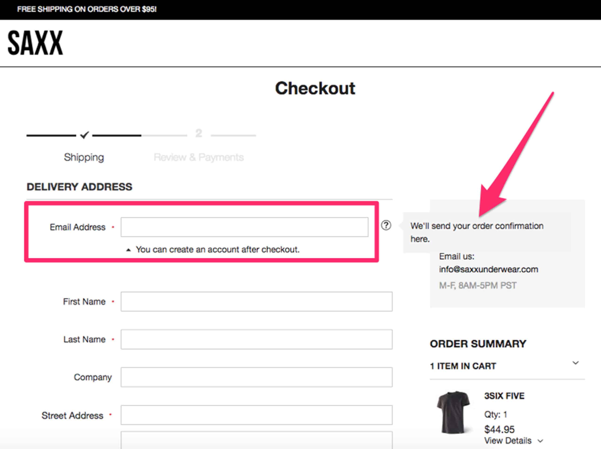
A checkout email address serves an order purpose. Decide separately how optional marketing is offered, recorded and managed; do not infer a subscription from a purchase alone.
The practical guidance
Steps, tools and examples
Define an offer that people can evaluate
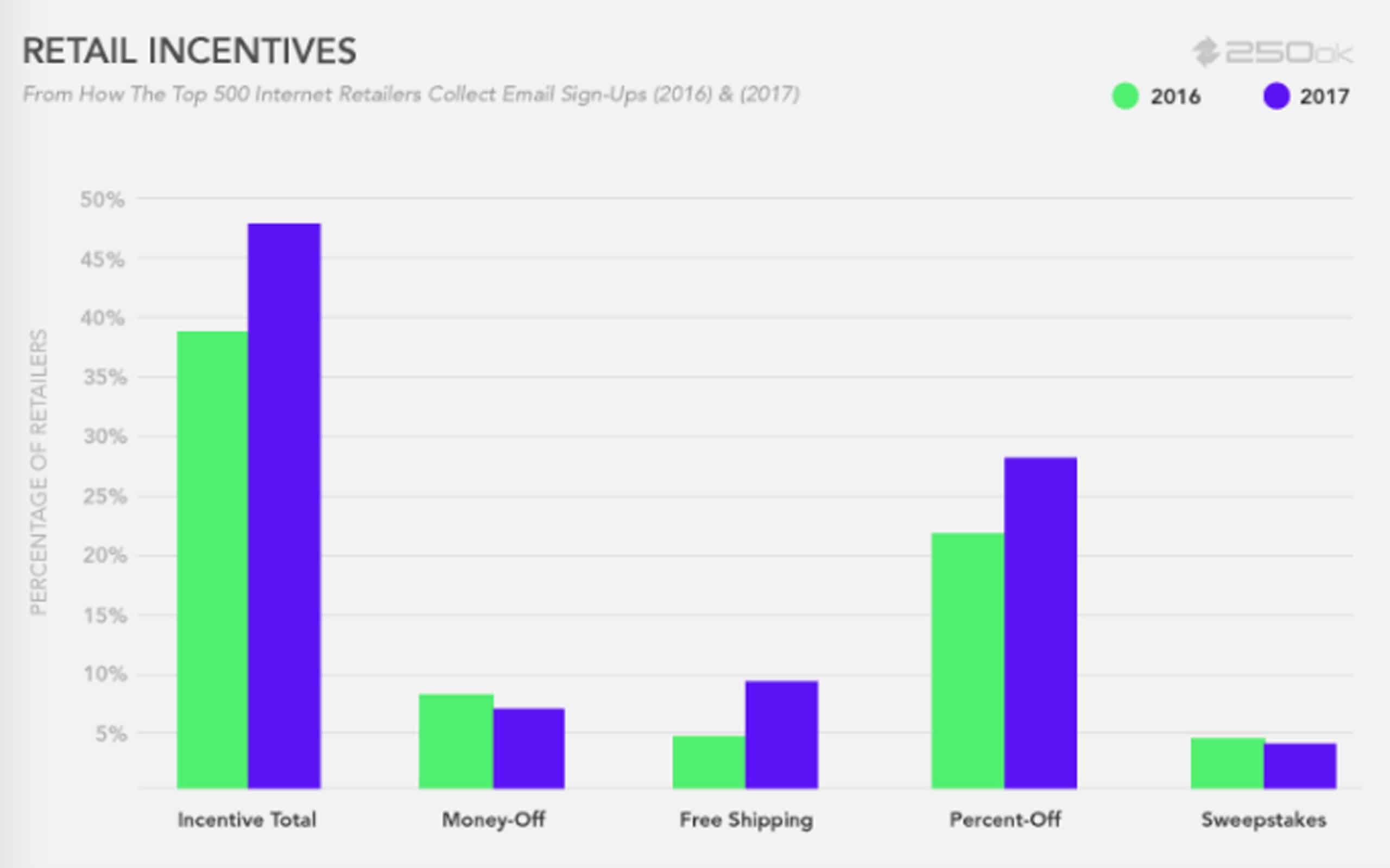
“Join our newsletter” gives very little information. Describe a useful reason to subscribe: product care advice, a monthly range update or early notice of a release. State what the subscriber can expect, and keep the wording consistent across the form and welcome email. A discount can be part of the offer, but confirm its actual conditions with the business before putting it into artwork.
Choose the offer before choosing the form treatment. If the content team cannot sustain a weekly update, do not make that promise to make the signup sound more attractive. A smaller, understandable commitment is easier to deliver and review.
Design the signup around the shopping task
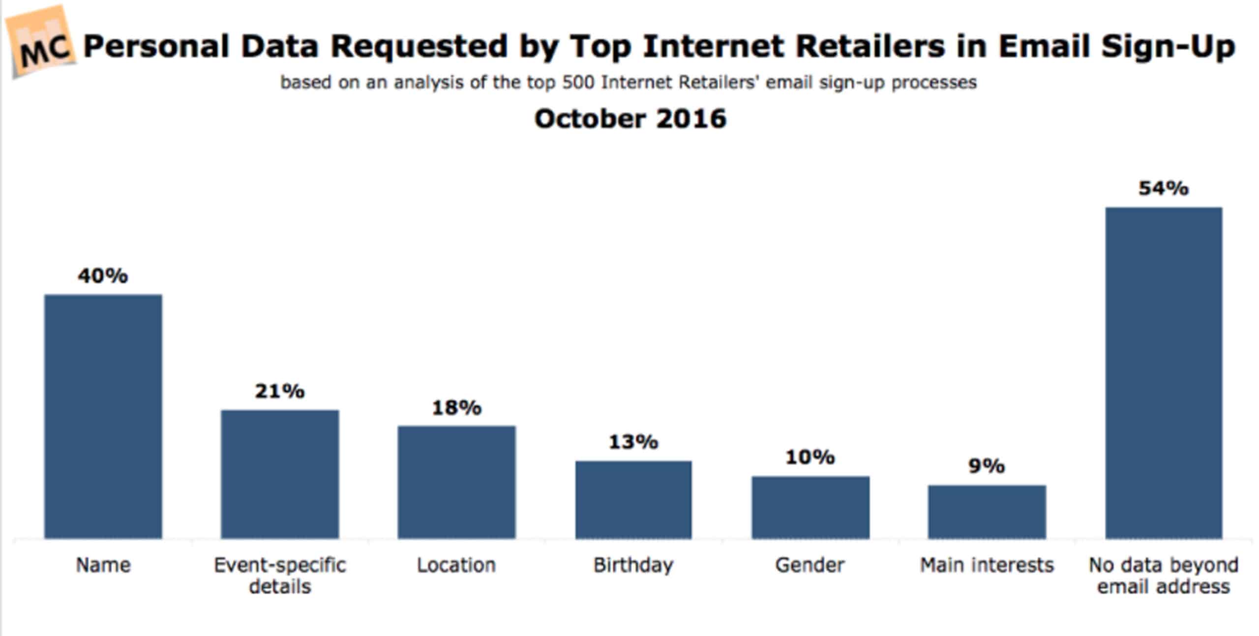
Use a short label, an understandable field and a clear confirmation. Ask only for information needed for the planned messages. A person’s name or preferences should have a purpose, rather than being collected because a template included them. On mobile, check that a popup can be closed and that it does not trap the user away from product information.
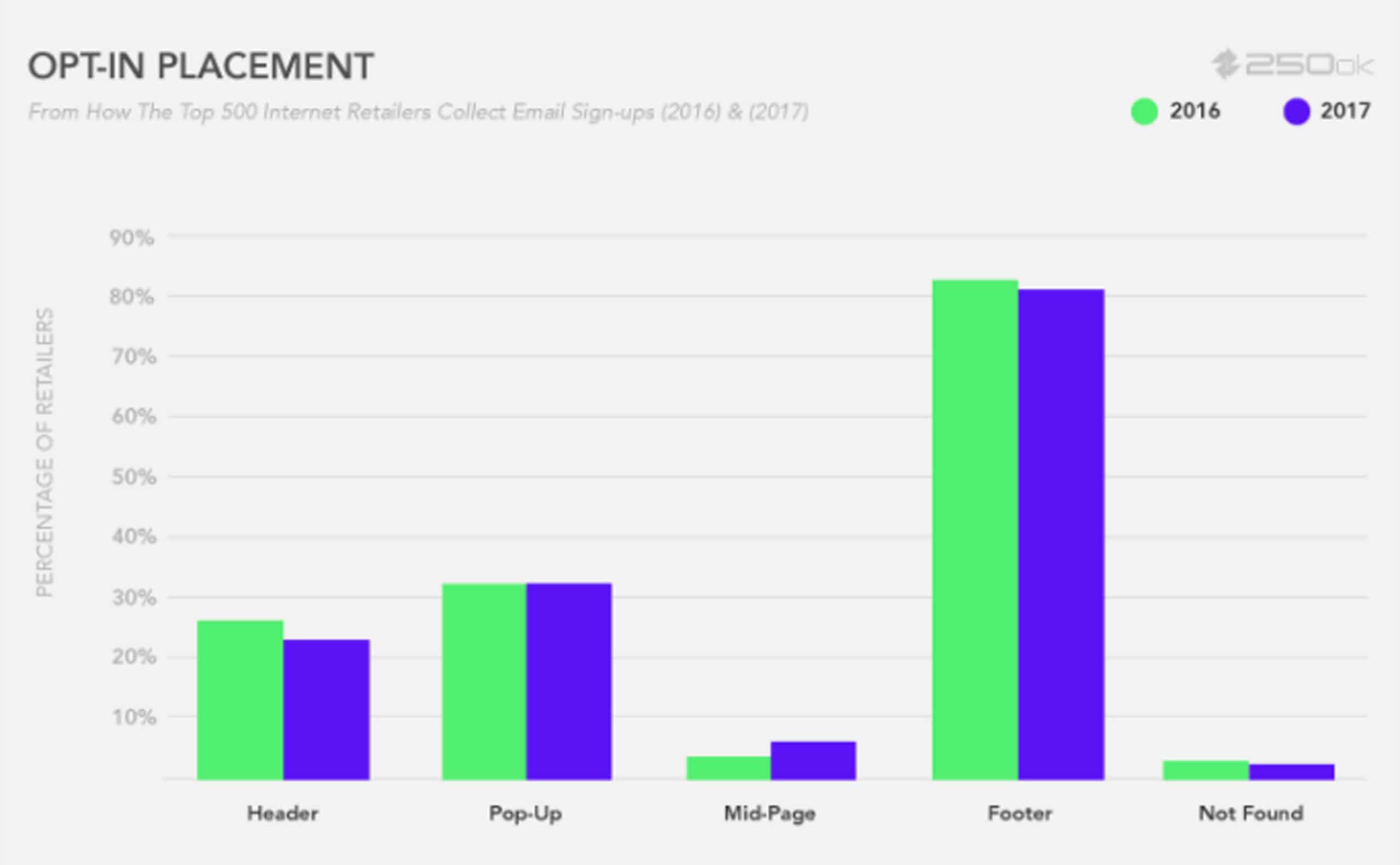
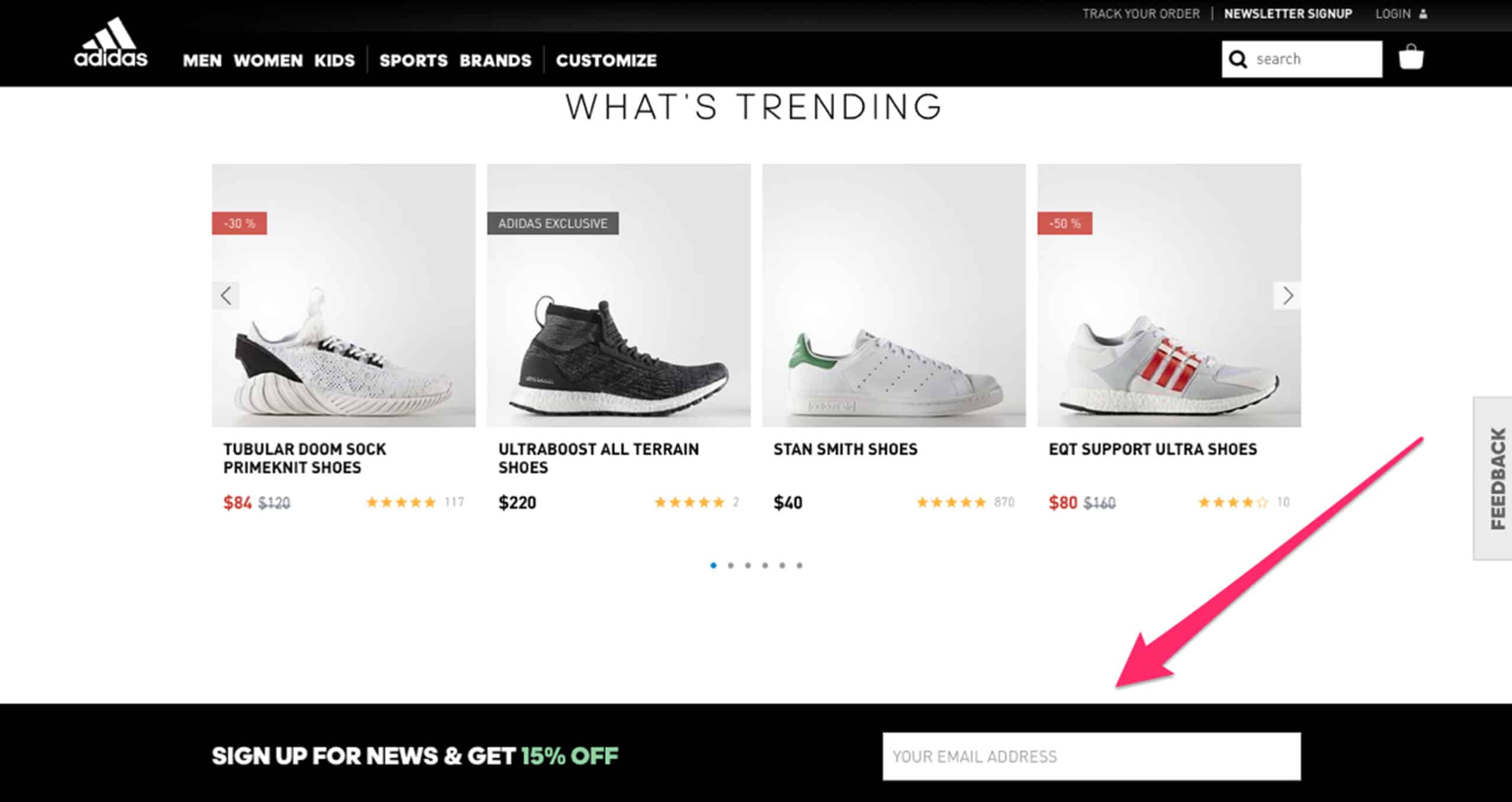
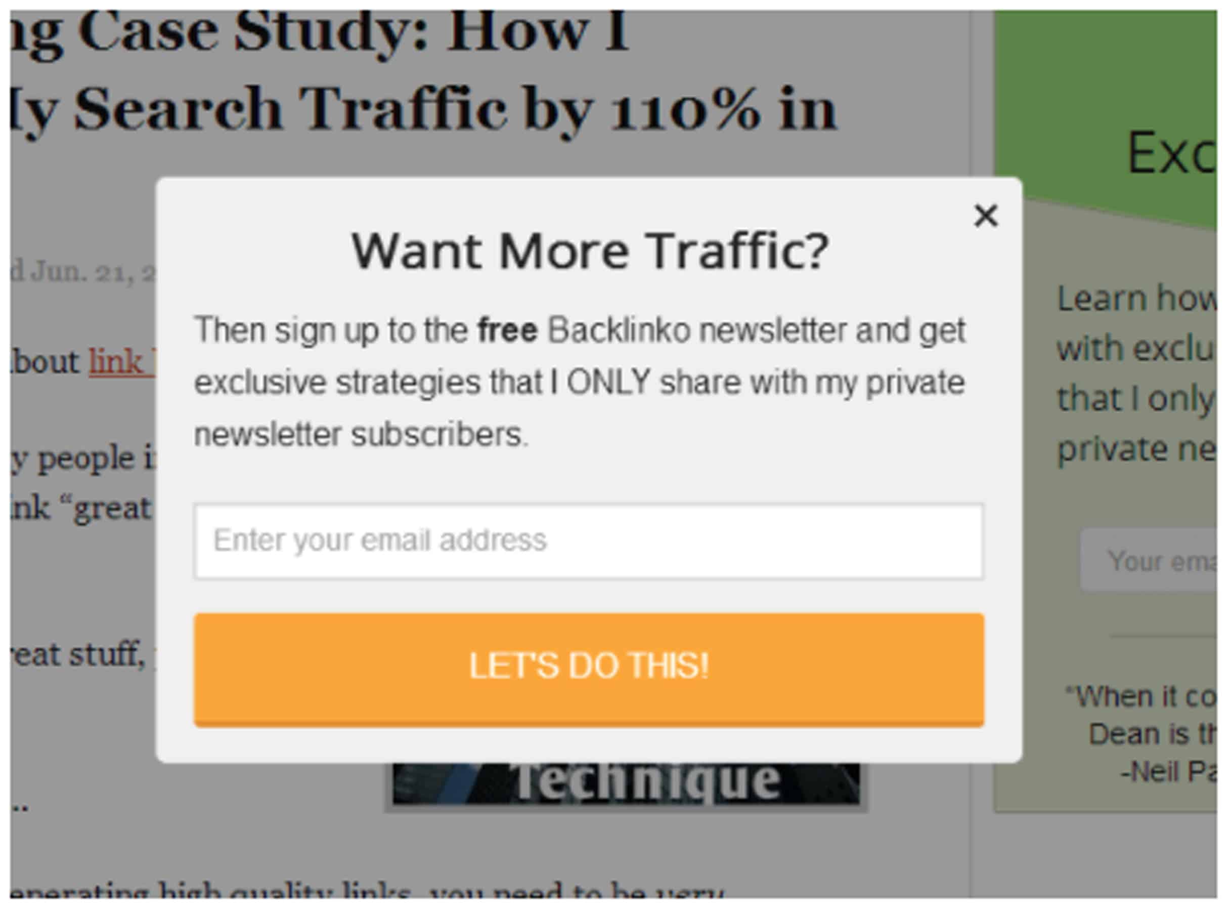
A footer form gives a persistent route without interrupting each page. A dedicated signup page gives space to explain the offer. A popup needs its timing and frequency assessed in context. These are design options to review, rather than universal winners.
Make the marketing choice deliberate
Keep optional marketing separate from the information needed to process an order. Use wording that identifies the business and the intended messages. Retain a suitable record of the choice, and check how imported contacts, preference changes and withdrawals are handled.
Mailchimp’s permission guidance explains the platform’s approach to clear, verifiable marketing permission. South African teams should consult the Information Regulator’s direct-marketing guidance when reviewing their process. The design brief should identify who approves the wording and contact-handling arrangements.
Plan the welcome and ongoing content
The first message should acknowledge the signup, deliver any promised resource or offer and explain what comes next. Make the sender recognisable and the useful action easy to find. Test the layout with real content rather than a blank branded template.
Group people only where it helps the message: an expressed product interest, a chosen content preference or another relevant, appropriately collected detail. Do not assume that everyone who purchased one item wants every promotion. A segment still needs a useful message; dividing the database does not create one.
Copy this signup review sheet
For each signup location, record: page; offer; fields; permission wording; record location; confirmation; first email; preference link; unsubscribe result; owner. Mark each result as checked, needs work or not applicable. Test an invalid address, a successful signup, a repeated attempt and leaving the list. Confirm what the chosen platform actually stores.
Fictional example: a homeware shop offers a monthly care-and-new-arrivals email. Its product page links to a short signup page. The team prepares one welcome message with care guidance, asks separately whether the person wants tableware or textile updates, and records who maintains those preferences. The example describes a workflow, not a sales result.
Existing reference images
Archived signup illustrations
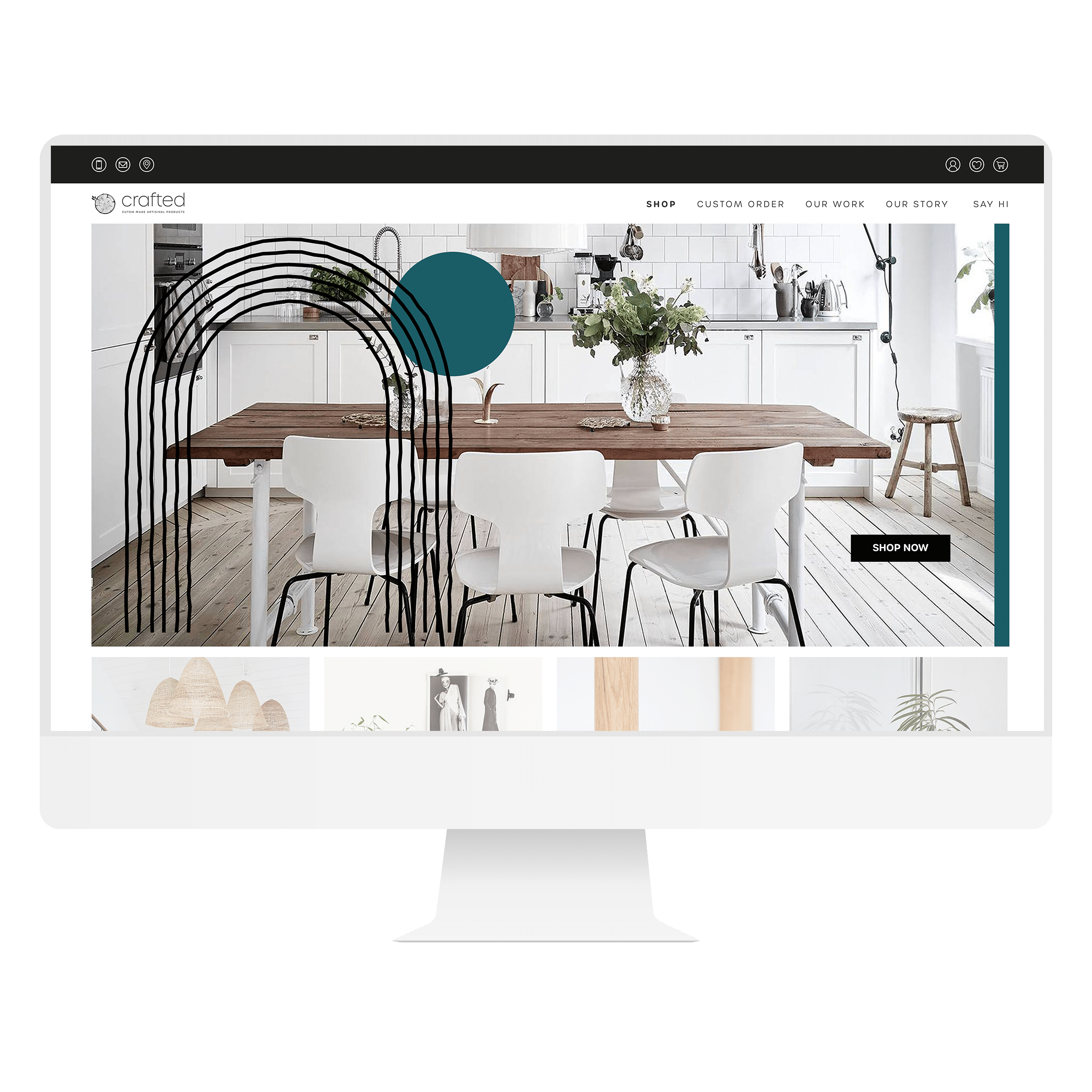
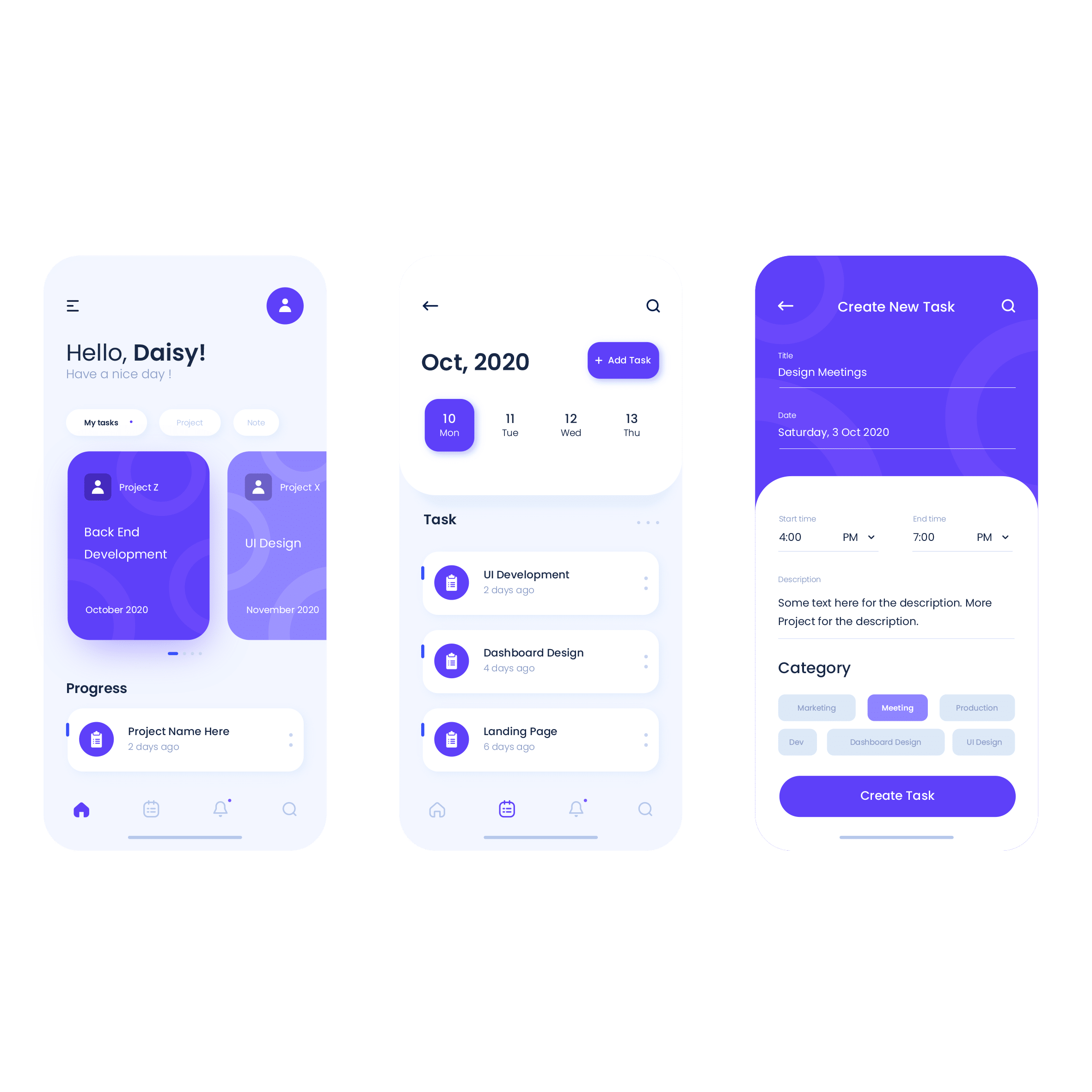
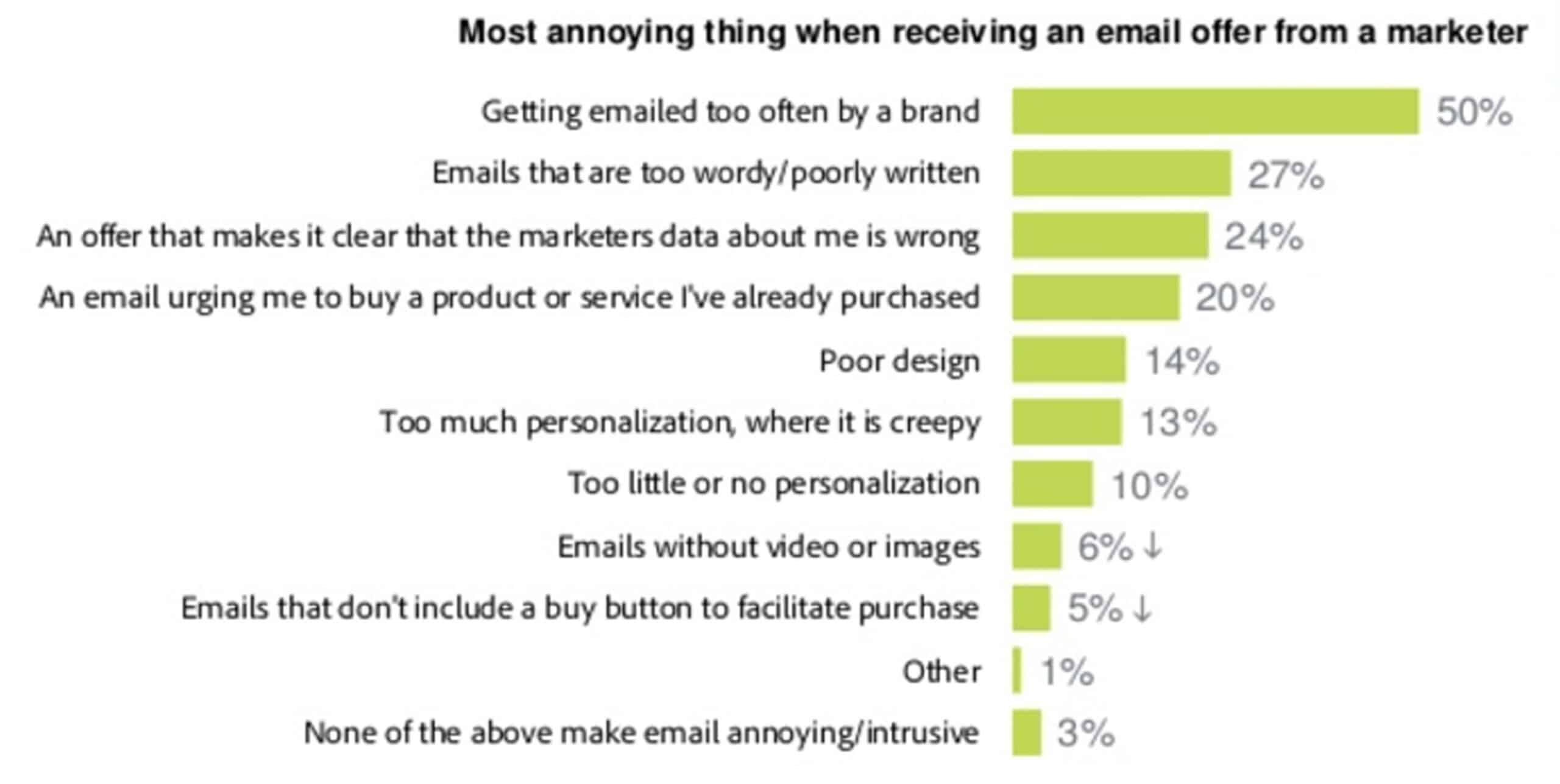
These existing screenshots are retained as visual references. Interfaces and offers may have changed; they are separate from the current guidance above.
Keep the work useful
Common mistakes to avoid
- Promising content that the team cannot produce
- Using a preselected choice as the design default
- Collecting personal details with no clear purpose
- Measuring list size while ignoring complaints and departures